
Dianna Frid
Dianna Frid was born in Mexico City. As a teenager, Frid immigrated with her parents and siblings to Vancouver, Canada. Based in Chicago since 2000, Frid has exhibited her work in the USA, Mexico, Canada, and abroad. Her work is in the public collections of the Cleveland Clinic, the Art Institute of Chicago, the DePaul Art Museum, the National Museum of Mexican Art, and others. A database of her artist’s books is in the collection of the Watson Library at the Metropolitan Museum of Art. Recent exhibits include “pre-knowing / un-knowing” (solo) at Patron Gallery, 2023; “Time is Textile” (solo) at the Alan Koppel Gallery in Chicago, Nov 2022 to Jan 2023; and the group exhibit “Headlines” at the Winnipeg Art Gallery, Oct 2022 to Sept 2023. Dianna Frid recently completed artist residencies at the Albers Foundation in Bethany, Connecticut and Joya in Andalusia, Spain. In June 2022, Dianna Frid and poet Victoria Chang presented a performance lecture at the Dia Art Foundation in New York City as part of their Poetry& series. In addition to Artadia, Frid has received grants and fellowships from the Canada Council for the Arts, the Fundación Alfredo Harp Helú Oaxaca, 3Arts, the Illinois Arts Council, the UIC Office of the Vice Chancellor for Research and the Chicago Department of Cultural Affairs. Frid is a 2023 recent recipient of a Canada Council for the Arts Grant. She is an educator in the Art Department at the University of Illinois at Chicago.
Frid examines the relationships between material texts and textiles. The Latin root of these words is texere: “to weave.” This etymology illuminates how weaving is a seven-thousand-year-old method of coding akin to writing. She has recently started working in photography, and will be presenting new photographic works as part of her Wormholes Project in Oaxaca in 2025. With textiles, Frid's approach to making is technically closer to drawing and needlework than it is to weaving, and it embraces the interconnected experiences of the linguistic, the visual, and the physical in ways that cloth has done across time. Thread, as Frid uses it, lends itself to re-invigoration without losing its connections to important feminist lineages of craft. Frid's work helps us encounter material and conceptual practices openly. It invites us to appreciate in them the experiment in which sensuality and thinking are not perceived as binaries: they emerge together.
To see more of her work, visit her website. To see a selection of videos of her artist's books, visit her Vimeo page.
Profile caption: Dianna Frid in her temporary studio in Oaxaca, Mexico, October 2023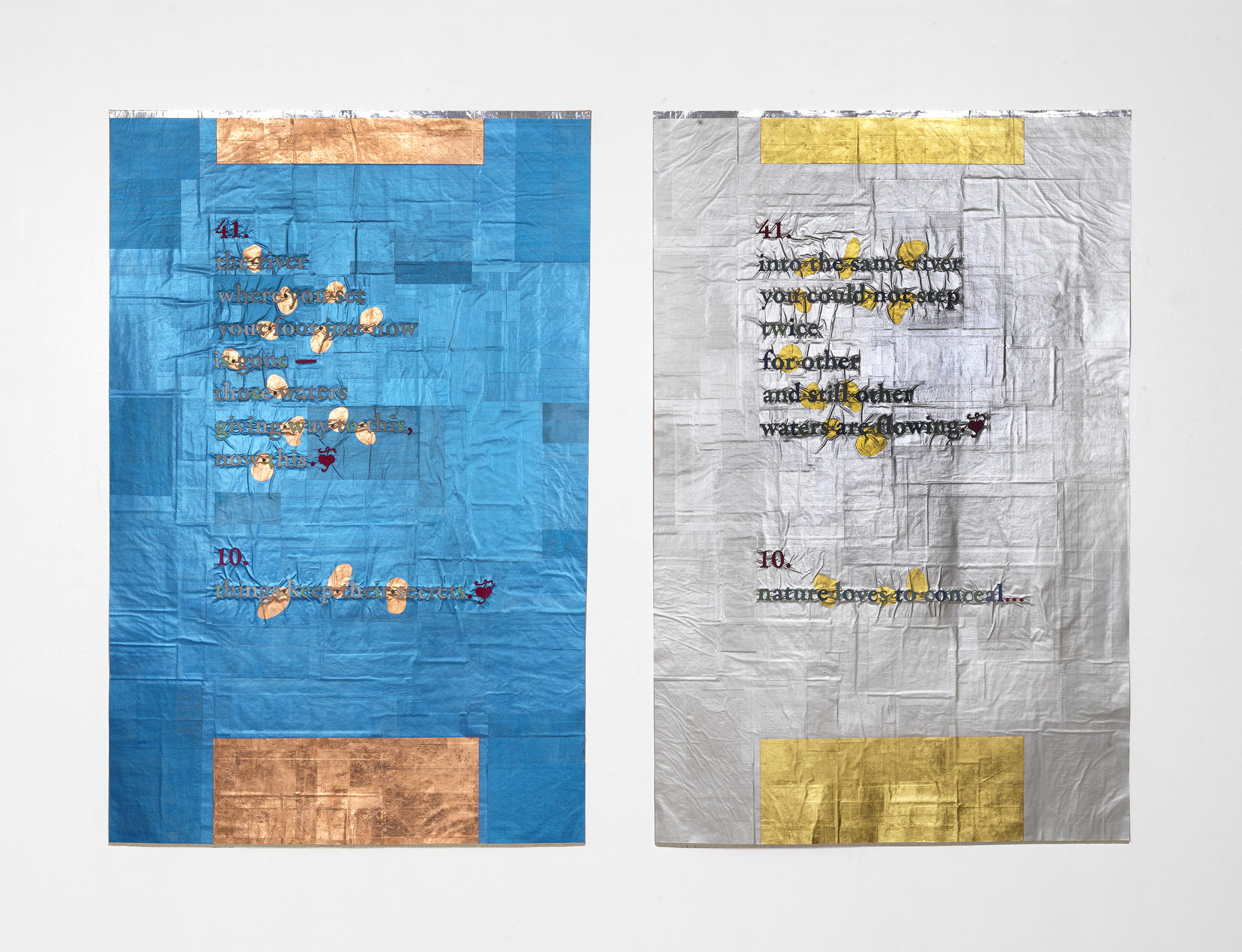 Title: “The River, Twice (after translations of two Heraclitus fragments: left, Brooks Haxton, 2001; right, G.T.W. Patrick, 1889) / Date: 2023 / Materials: Canvas, paper, ink with mica, acrylic paint, embroidery floss, copper leaf, gold leaf, aluminum
Tom Van Eynde
Title: “The River, Twice (after translations of two Heraclitus fragments: left, Brooks Haxton, 2001; right, G.T.W. Patrick, 1889) / Date: 2023 / Materials: Canvas, paper, ink with mica, acrylic paint, embroidery floss, copper leaf, gold leaf, aluminum
Tom Van Eynde
Featured Artworks
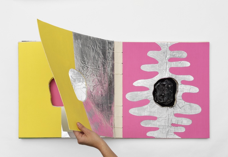 Kernel
2022 Closed: 18 x 17.5 x 2.75 inches; Open: 18 x 35 x 2.5; 62 pages Cloth, aluminum, thread, and obsidian (volcanic glass) from Mexico
Photo by Tom Van Eynde
“Kernel” was one of seven new artist’s books made for the solo exhibition “Time is Textile” (Alan Koppel Gallery, Chicago, Nov 2022 to January 2023). It incorporates recurring concerns around holes in books. Inside “Kernel” there is a piece of volcanic glass—obsidian from the Valley of Mexico (which is where I was born). The obsidian is niched within layers of pages. The niche-hole becomes more apparent as the pages are turned, and the obsidian is laid bare. Books have stable structures and, as such, the form offers a generous expanse for improvisation, hence the variations in patterns that mark time and rhythm. Rhythm is a guiding principle. If the obsidian is the kernel, then the book is the seed.
Kernel
2022 Closed: 18 x 17.5 x 2.75 inches; Open: 18 x 35 x 2.5; 62 pages Cloth, aluminum, thread, and obsidian (volcanic glass) from Mexico
Photo by Tom Van Eynde
“Kernel” was one of seven new artist’s books made for the solo exhibition “Time is Textile” (Alan Koppel Gallery, Chicago, Nov 2022 to January 2023). It incorporates recurring concerns around holes in books. Inside “Kernel” there is a piece of volcanic glass—obsidian from the Valley of Mexico (which is where I was born). The obsidian is niched within layers of pages. The niche-hole becomes more apparent as the pages are turned, and the obsidian is laid bare. Books have stable structures and, as such, the form offers a generous expanse for improvisation, hence the variations in patterns that mark time and rhythm. Rhythm is a guiding principle. If the obsidian is the kernel, then the book is the seed.
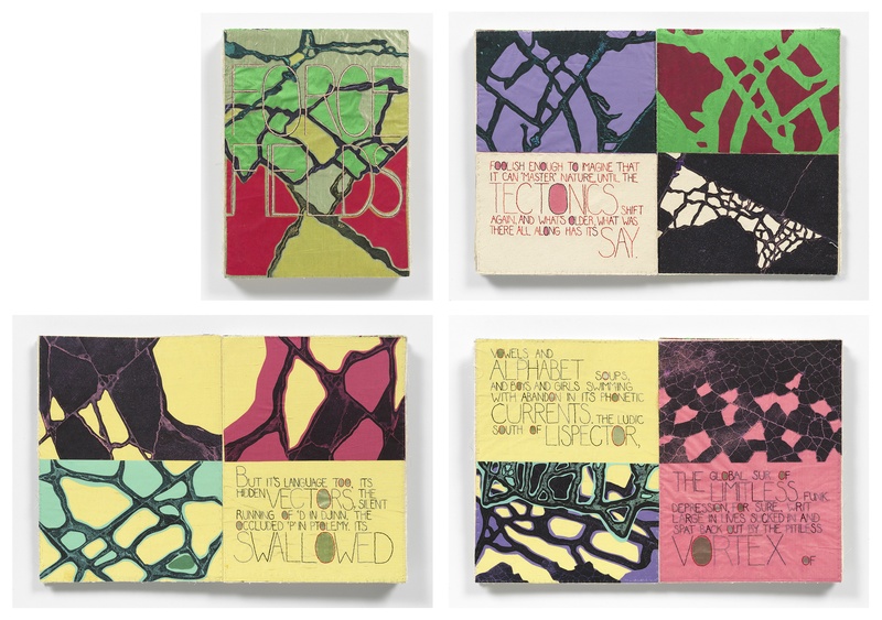 FORCEFIELD
Date: 2021 / Materials: Canvas, silk, photographic image transfers, thread / Dimensions: Closed 15 x 11 in; Open 15 x 22.5 in
Photo by Tom Van Eynde
Mid-June 2020. We were three months into lock-down, death tolls rising, the corona in search of hosts and finding them. It was less than a month after George Floyd’s murder and the glass was breaking and the voices were rising. Two words emerged, and they made one word: Forcefields. And I said, “Ko, here it is: Forcefields.” And Ko made a text. This book is a charm.
FORCEFIELD
Date: 2021 / Materials: Canvas, silk, photographic image transfers, thread / Dimensions: Closed 15 x 11 in; Open 15 x 22.5 in
Photo by Tom Van Eynde
Mid-June 2020. We were three months into lock-down, death tolls rising, the corona in search of hosts and finding them. It was less than a month after George Floyd’s murder and the glass was breaking and the voices were rising. Two words emerged, and they made one word: Forcefields. And I said, “Ko, here it is: Forcefields.” And Ko made a text. This book is a charm.
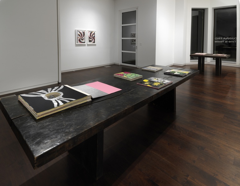 Installation view of Time is Textile at Alan Koppel Gallery
Photo by Tom Van Eynde
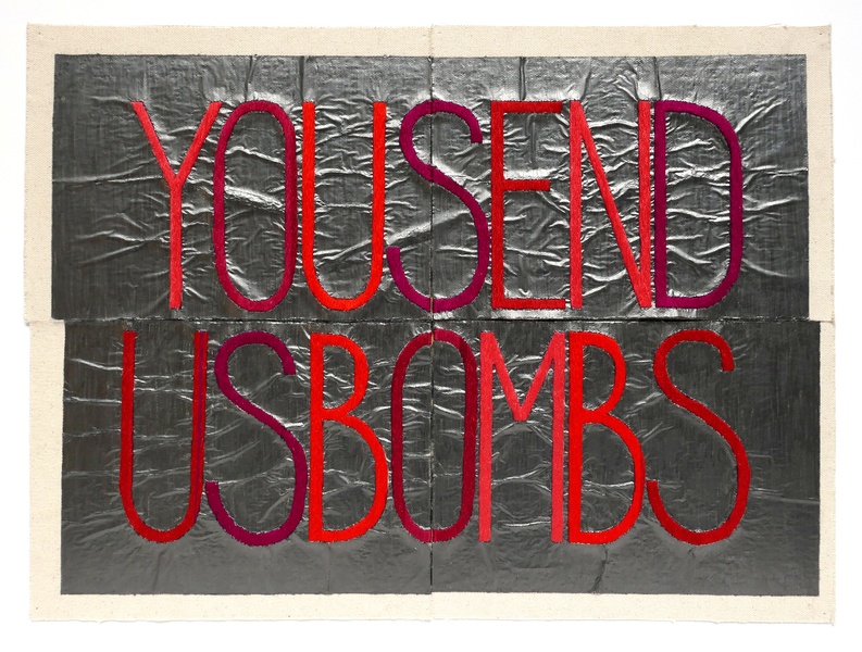
“Time is Textile” (Nov 2022 to Jan 2023) featured seven new artist’s books and three new mixed-medium textile-based works. The works arose from the feelings of events that took place during the pandemic. These were poignant years. At the beginning, the works alluded to themes of turmoil and mortality; violence and political discord. Gradually, as I made new pieces and as we saw the end of a difficult collective time, the works became affirmations of the life-force that emerges from making and experiencing art in all its forms.
Installation view of Time is Textile at Alan Koppel Gallery
Photo by Tom Van Eynde
“Time is Textile” (Nov 2022 to Jan 2023) featured seven new artist’s books and three new mixed-medium textile-based works. The works arose from the feelings of events that took place during the pandemic. These were poignant years. At the beginning, the works alluded to themes of turmoil and mortality; violence and political discord. Gradually, as I made new pieces and as we saw the end of a difficult collective time, the works became affirmations of the life-force that emerges from making and experiencing art in all its forms.
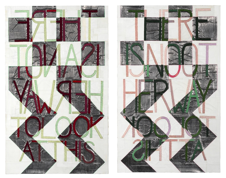 THERE IS AND THERE IS NOT
Diptych / Date: 2021 / Materials: Muslin, embroidery floss, graphite, gesso, board / Each panel measures 28 x 18 inches
Photo by Tom Van Eynde
THERE IS AND THERE IS NOT
Diptych / Date: 2021 / Materials: Muslin, embroidery floss, graphite, gesso, board / Each panel measures 28 x 18 inches
Photo by Tom Van Eynde
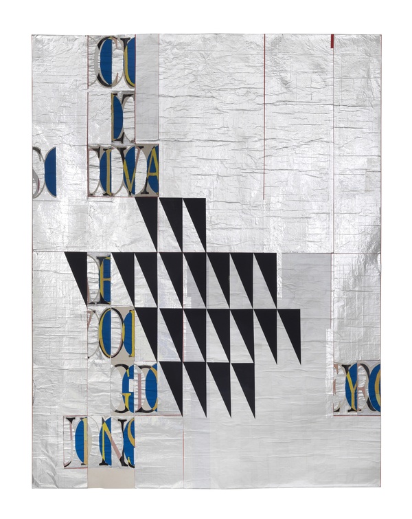 WE HAVE NOT WORD IN ENGLISH FOR THIS
Date: 2021 / Materials: Canvas, aluminum, paper, paint, embroidery floss / Dimensions: 76 x 60 inches
Photo by Tom Ban Eynde
WE HAVE NOT WORD IN ENGLISH FOR THIS
Date: 2021 / Materials: Canvas, aluminum, paper, paint, embroidery floss / Dimensions: 76 x 60 inches
Photo by Tom Ban Eynde
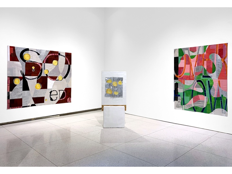
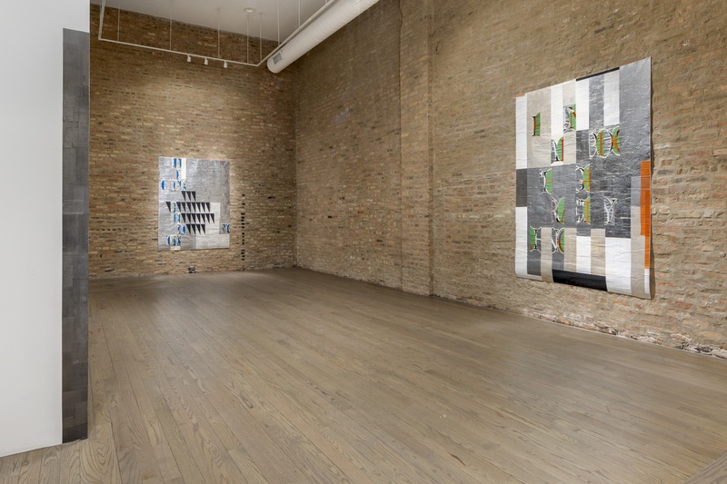 Gallery view of of two works, on the left WE HAVE NOT WORD IN ENGLISH FOR THIS; on the right WEAVE. These works are from the OVERFLOWS series on view in the exhibit “pre-knowing / un-knowing” at Patron Gallery, Chicago, June 3 – Aug 19, 202
Photo by Evan Jenkins
Gallery view of of two works, on the left WE HAVE NOT WORD IN ENGLISH FOR THIS; on the right WEAVE. These works are from the OVERFLOWS series on view in the exhibit “pre-knowing / un-knowing” at Patron Gallery, Chicago, June 3 – Aug 19, 202
Photo by Evan Jenkins
Two works from the OVERFLOWS series
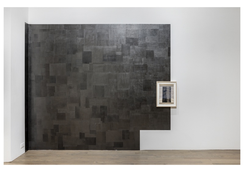 EVIDENCE OF THE MATERIAL WORLD #10
Made with hand drawn graphite films mounted on the wall, the works in these series are site-bound temporary installations. This is the tenth work in the series. / 80 inches tall by 120 inches wide
Installation photo by Evan Jenkins
Evidence of the Material World is an ongoing series of wall drawings made with graphite membranes. These are made alongside existing architectural features of a given space. This view is of an iteration —number ten.
EVIDENCE OF THE MATERIAL WORLD #10
Made with hand drawn graphite films mounted on the wall, the works in these series are site-bound temporary installations. This is the tenth work in the series. / 80 inches tall by 120 inches wide
Installation photo by Evan Jenkins
Evidence of the Material World is an ongoing series of wall drawings made with graphite membranes. These are made alongside existing architectural features of a given space. This view is of an iteration —number ten.
 Soledad and Desbordar / Overflow, with From Before You Had a Name in the center Presented at the Smart Museum of Art Chicago, 2019
Photo by Dianna Frid
Soledad and Desbordar / Overflow, with From Before You Had a Name in the center Presented at the Smart Museum of Art Chicago, 2019
Photo by Dianna Frid
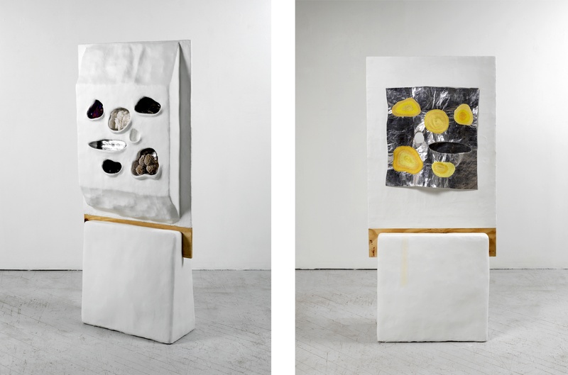 FROM BEFORE YOU HAD A NAME
Date: 2017 / Dimensions: 67 x 31 x 14 inches / Materials: Plaster, cardboard, cement, paint, wood, canvas, embroidery floss, and rocks. All the rocks are from the landmass that today is called Mexico
Clockwise: peacock ore a.k.a. bornite, aragonite, obsi
Photo by Tom Van Eynde
These rocks and minerals are thousands of years old. All of these are from the landmass that is known today as Mexico. Yet all of these existed before Mexico, before this landmass, had a name. The long view that Geological time offers continues to feel important. I was born in Mexico and grew up there during the formative years of my childhood. I moved to Vancouver when I was fifteen. I currently live in the US. I made this piece just after Trump was elected and anti-immigration voices became forceful.
FROM BEFORE YOU HAD A NAME
Date: 2017 / Dimensions: 67 x 31 x 14 inches / Materials: Plaster, cardboard, cement, paint, wood, canvas, embroidery floss, and rocks. All the rocks are from the landmass that today is called Mexico
Clockwise: peacock ore a.k.a. bornite, aragonite, obsi
Photo by Tom Van Eynde
These rocks and minerals are thousands of years old. All of these are from the landmass that is known today as Mexico. Yet all of these existed before Mexico, before this landmass, had a name. The long view that Geological time offers continues to feel important. I was born in Mexico and grew up there during the formative years of my childhood. I moved to Vancouver when I was fifteen. I currently live in the US. I made this piece just after Trump was elected and anti-immigration voices became forceful.
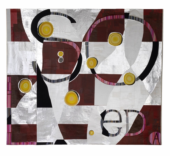 Soledad
(part of 'The Overflows' series)
Photo by Tom Van Eynde
Canvas, paper, embroidery floss, aluminum, paint // 78 x 90 inches
Soledad
(part of 'The Overflows' series)
Photo by Tom Van Eynde
Canvas, paper, embroidery floss, aluminum, paint // 78 x 90 inches
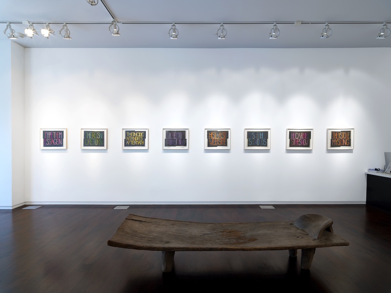 Words from Obituaries
Partial installation view of “More Time than Life”
Photo by Tom Van Eynde
Words from Obituaries
Partial installation view of “More Time than Life”
Photo by Tom Van Eynde
In 2010 I started an archive of obituaries, which I loosely classify according to a typology of professions. I codify groups of related occupations in different colors: for example, persons whose work was dedicated to language (poets, translators, linguists, writers…) are classified in pink; those who worked in scientific exploration (astronauts, physicists…) are classified in green, and so on. I embroider words chosen from particular obituaries in shades of the color corresponding to the profession of the person deceased. No “life-work” can be neatly classified. Persons are remembered for all kinds of things, some of which could be unspeakable, as in war crimes. Some people engaged in life work, such as philanthropy, which could be considered vocational, rather than professional. When systems of classification get messy—and they will—they become interesting. Why? The mess illuminates the fact that a human life (or whatever is being classified) is irreducible to one single, compelling account.
 NYT, NOV 30, 2017, ARMANDO HART from the "Words From Obituaries" Series
Canvas, paper, embroidery floss, graphite 15 x 20 inches
Photo by Dianna Frid
NYT, NOV 30, 2017, ARMANDO HART from the "Words From Obituaries" Series
Canvas, paper, embroidery floss, graphite 15 x 20 inches
Photo by Dianna Frid
As I sort through hundreds of obituaries I find, in a few of them, samplings of phrases that are just right. They seize a moment in language that operates both within and outside the source. I do not choose these words for their narrative or honorific value, but rather for an urgency that is external, yet related, to those values. Each finished piece measures 15 x 20 inches; what may vary is the number of letters and therefore the number of rows. I don't add or change words, however I remove the spaces between words and, if present, take out punctuation marks. Some words are fragmented between rows of text. All this provokes an expanded reading where words arise from within words, and letters latch onto letters in adjacent words. SENSE and FORM shift: sometimes the letters are more apparent than the words, and vice-versa.
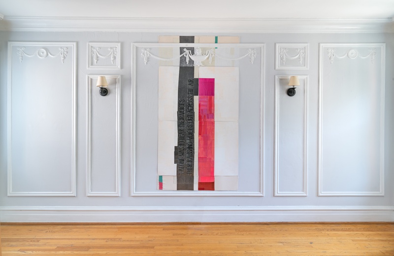 The Sirens
Paper, paint, graphite, and embroidery floss on canvas. 72 x 44.5 inches These words—from "The Odyssey"—are embroidered: I ALONE WAS TO HEAR THEIR VOICES, THEIR RAVISHING VOICES OUT ACROSS THE AIR.
Photo by Robert Chase Heishman
The Sirens
Paper, paint, graphite, and embroidery floss on canvas. 72 x 44.5 inches These words—from "The Odyssey"—are embroidered: I ALONE WAS TO HEAR THEIR VOICES, THEIR RAVISHING VOICES OUT ACROSS THE AIR.
Photo by Robert Chase Heishman
Installed onsite in private residence in Chicago's South Side. This is from an early body of work where I began to explore the integration of literature to visual work. The text is from The Odyssey and it reads: I ALONE WAS TO HEAR THEIR VOICES, THEIR RAVISHING VOICES OUT ACROSS THE AIR. The text refers to the siren's voices that Ulysses encounters during his journey.
Dianna Frid has crowd-funded a project with 3AP
-
- $13,130 raised of $6,000 goal
- 0 Days 0:00:00 LEFT
For several years I have been developing a series of artworks inspired by a remarkable collection of rare books at the Burgoa Library in Oaxaca, Mexico. What makes this collection surprising is that these books, over time, were marked by …
Read more about How to Peer Through a Wormhole